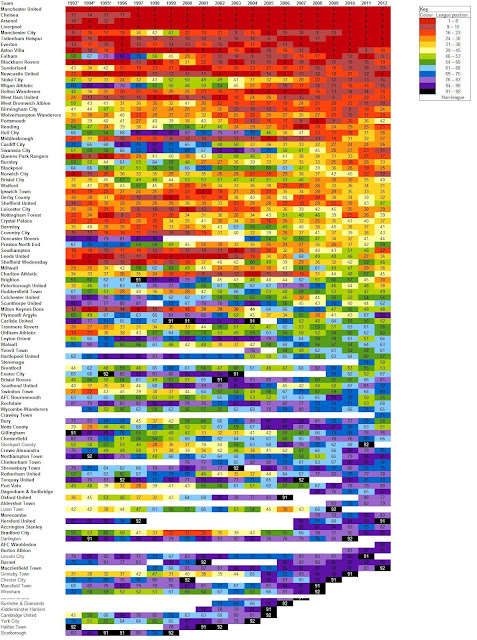
Clubs are arranged according to their average league position over the 20 years - that is, Manchester United are ranked highest because since 1992-93 their average league position (ALP) is 1.6. Clubs in boldface type are those who competed in the Football League/Premier League in 2011-12.
Monday, August 20, 2012
Graphic: The Football League heat map
This is a concept I've been playing around with for the past week. It's basically a year-by-year standings of the English Football League tree made to look pretty by colour-coding specific finishes. That is, red represents a league finish in the top 15 of the 92 Football League teams, a year highlighted in orange denotes a club finishing in position 16-30 and so on.
Clubs are arranged according to their average league position over the 20 years - that is, Manchester United are ranked highest because since 1992-93 their average league position (ALP) is 1.6. Clubs in boldface type are those who competed in the Football League/Premier League in 2011-12.
The map varies when this starting arrangement is altered: another heatmap will be uploaded shortly showing the League tree arranged according to ALP over the past five years:
Clubs are arranged according to their average league position over the 20 years - that is, Manchester United are ranked highest because since 1992-93 their average league position (ALP) is 1.6. Clubs in boldface type are those who competed in the Football League/Premier League in 2011-12.
Subscribe to:
Post Comments (Atom)


I'm still mastering from you, but I'm trying to obtain my objectives. I certainly appreciate looking at all that is placed on your website.Keep the details arriving. I beloved it.
ReplyDelete